DC SHOP REVAMP — a fan service visual facelift for a renowned brand.
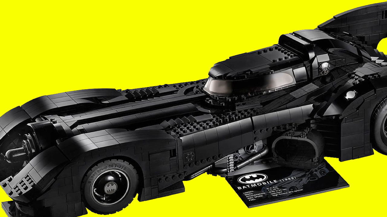


The DC Shop is one of the main hubs of the DC ecosystem. Not only are you able to read and buy comics, you can also buy merch of your favorite superheroes and villains! For this project, I was tasked to redesign the shop so that it looks more visually compelling, as well as boost the usability of the experience altogether.
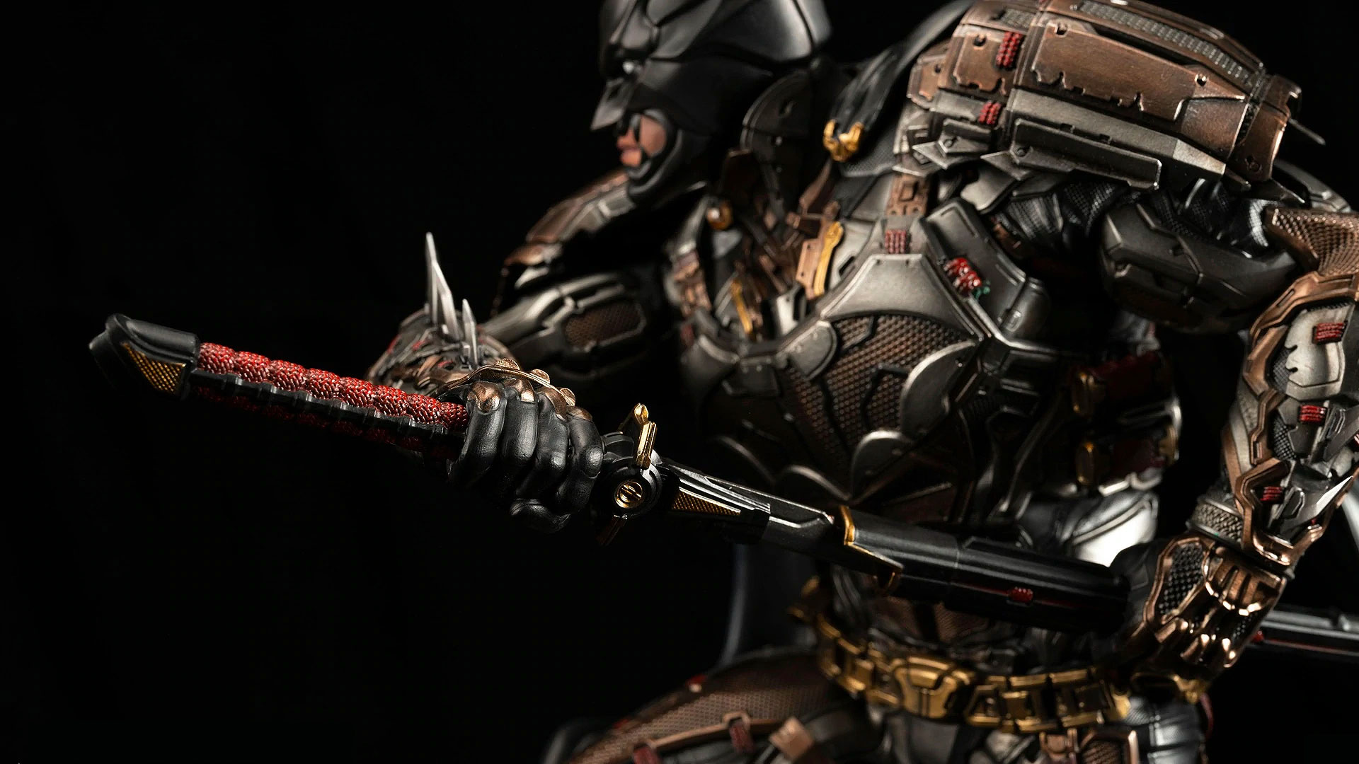
What are we trying to solve?
Stakeholders believed that there could be a better way to bring more visual appeal and utility to the DC Shop. The old experience, while functional, felt dated and overall not the most user friendly. I was tasked to help solve some of these issues.
My main goal was to tackle the above ask, while also doing fan service - which to me, was to highlight the beautiful art & products front and center. DC Comics is a heavily visual brand, and we should really highlight that where possible. I also made sure that the experience of browsing and searching for products felt natural and helpful to users.
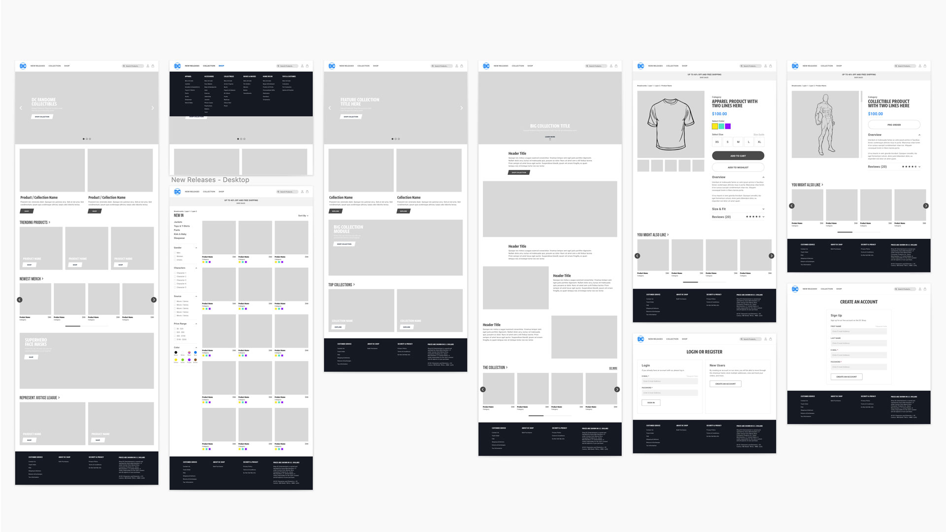
Initial Wireframes
The user journey was pretty straight forward since we had to lean on Shopify's platform, but I set out to lay out the wireframes for the new DC shop, which would house the beautiful content later on. My goal was to create an experience that felt clean, sharp, and intuitive for a ecommerce site.
Visual First Homepage
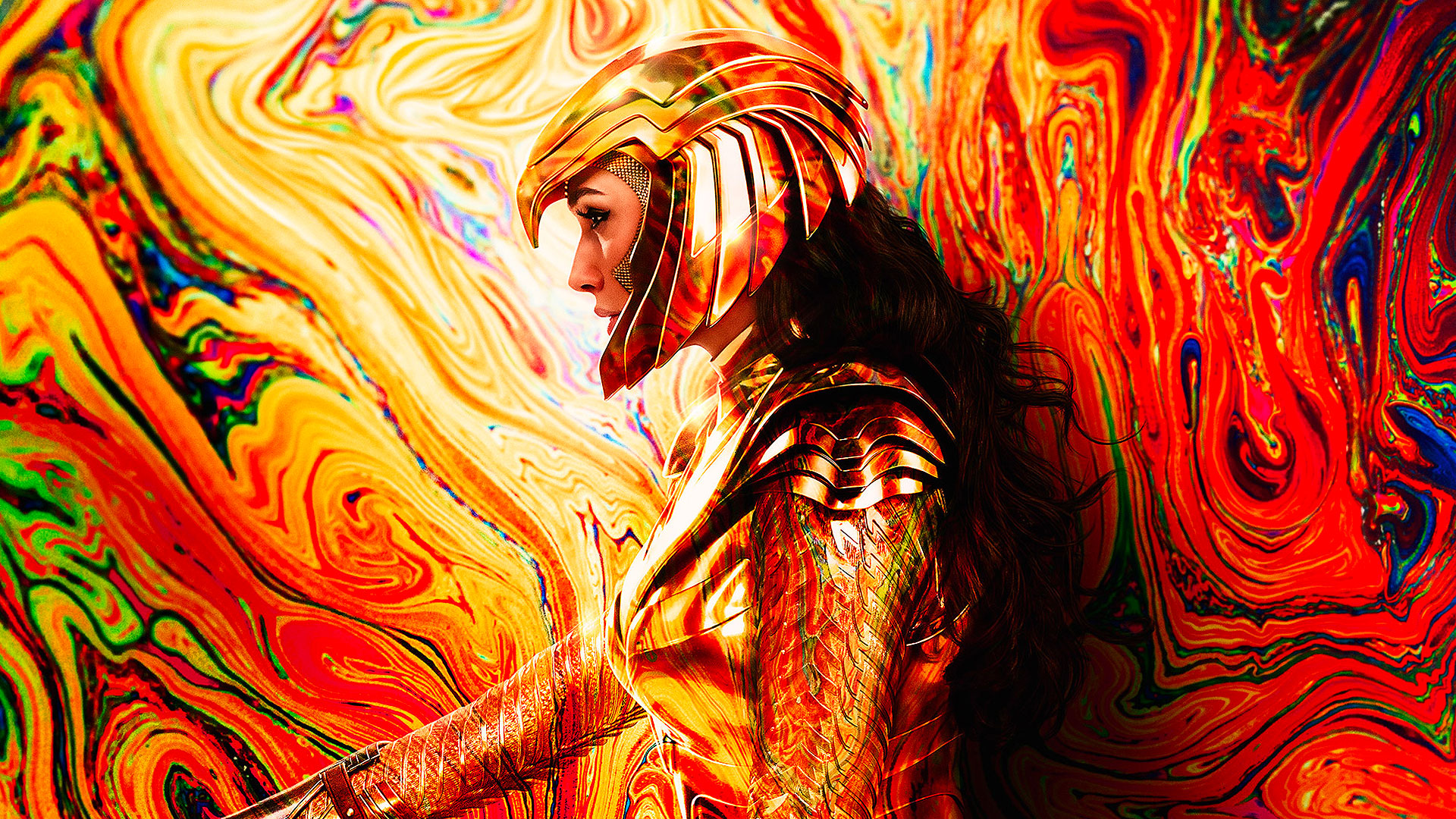
DC Comics is a highly visual brand. We have a vast library of artwork and products created by talented artists globally, and with that in mind, I wanted to highlight that front and center. For the new homepage, the goal was to create something that felt clean, uncluttered, but at the same time, visually impactful - letting the products do the work.
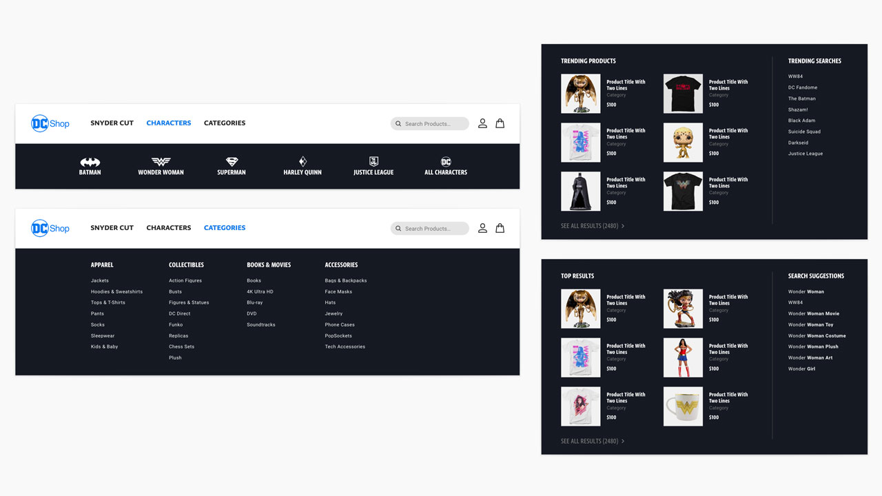
User Centric Nav Updates
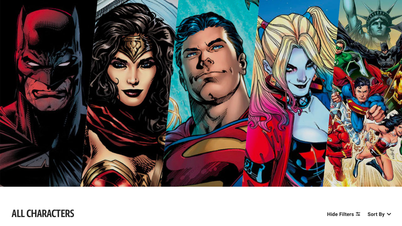
Through extensive user research, we found that the number 1 way for DC Comic readers and users to search, is by character. Especially the top superheroes such as Batman, Superman, Wonder Woman, etc. Thus, for the nav, I set out to present a character centric browsing experience for the shop. Other feature updates for the nav include a better organized bucketing of categories, displaying trending products and searches, and more.
Character Hubs
To further enforce the need to sort products by our top characters, I created a character selector carousel that would link users to a character specific hub page, which houses all of the products for that hero.
Collection Pages
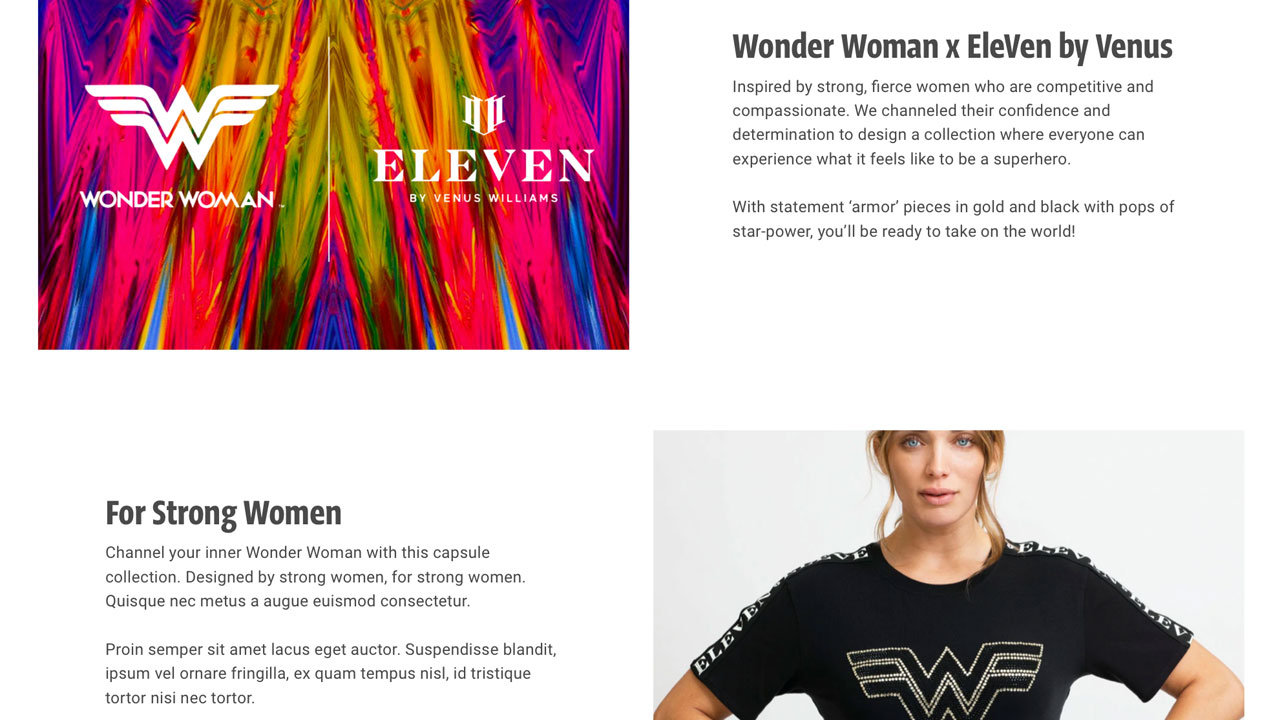
To support key beats from marketing, I designed a brand new featured collection page for special product drops. The design allows the content team to craft a story behind the collection before ultimately revealing the full collection of products.
User Friendly Filters
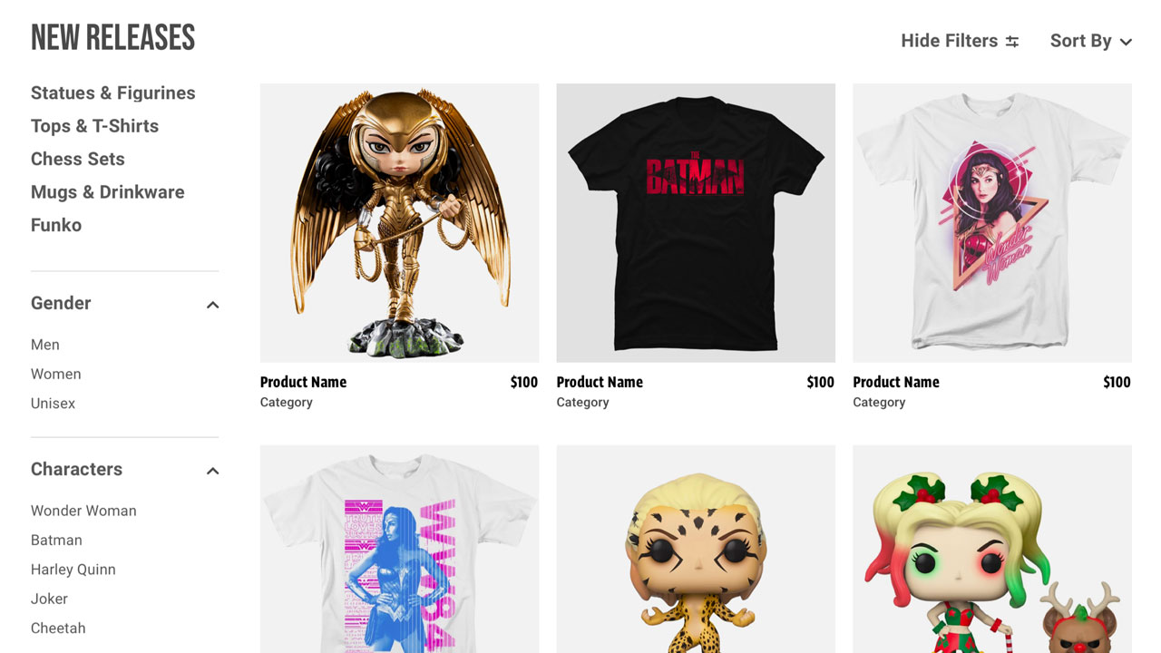
From a user experience perspective, I believe it's always good to allow users to drill down their results, to quickly get to their desired product/s. For the new shop results pages, I designed a new filtering menu with conscious decisions around category bucketing, priority of filters, etc, while ensuring that the users won't feel overwhelmed.
Product Detail Pages
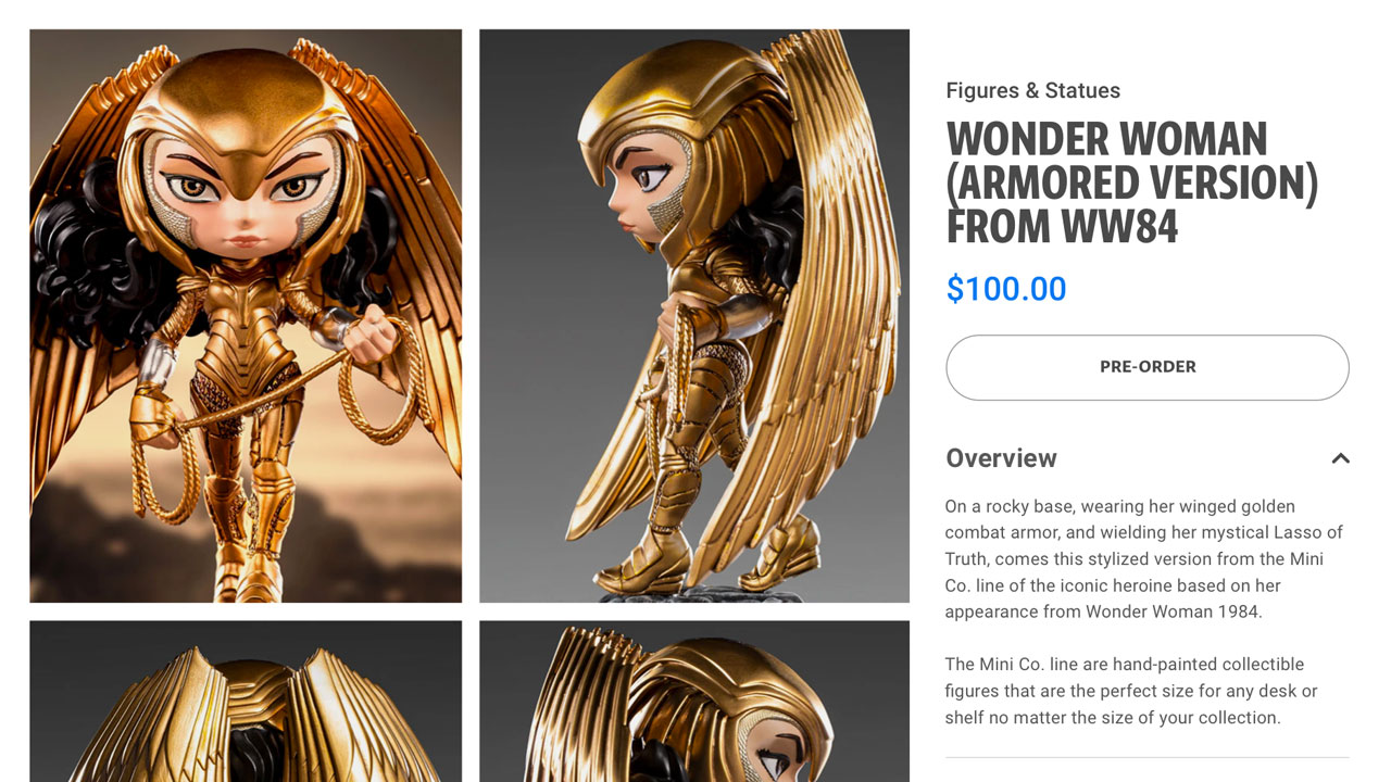
One of the most important pages for a ecommerce experience is the product detail page. I took this opportunity to redesign the page to maximize visual impact without introducing clutter. To achive this, I came up with a 2 column image grid, clear text hierarchy, and accordion modules for information that isn't as important, such as sizing, etc.
Error States
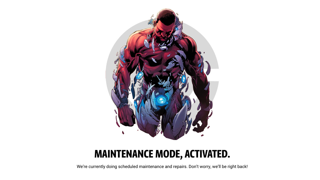
No stones were left unturned for this DC Shop redesign. I even took the time to design meaningful error states which align with the brand visuals and voice.
Mobile Friendly
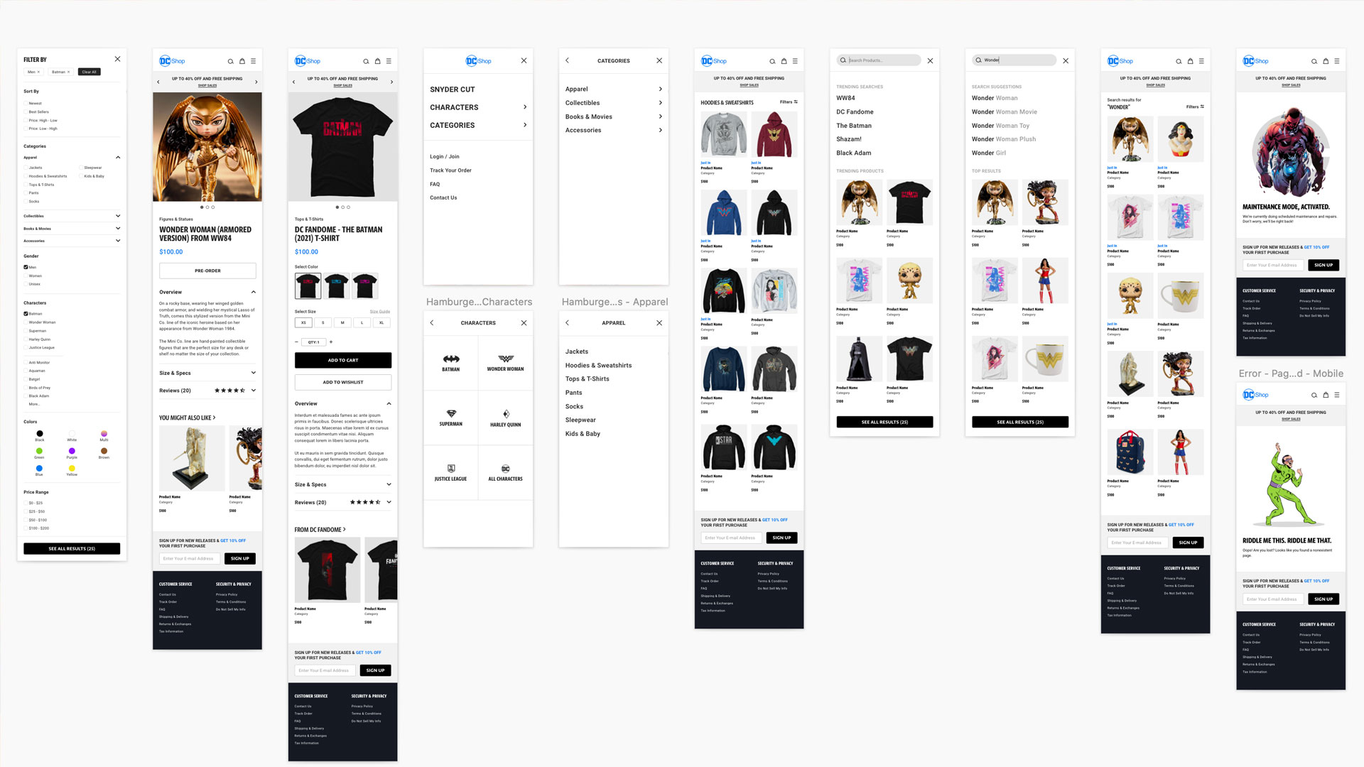
One of the biggest challenges for a potentially dense and confusing experience like a ecommerce site, is how to ensure that it feels good for mobile users. I made sure that each page would look just as good for mobile, as it does for desktop. There were elements that needed to be completely redesigned for mobile, such as the nav and product filters, but it was a necessary task to ensure that the product remains clean and intuitive.
Overall, the DC Shop redesign was an amazing task to take on, as it really challenged me to find the right balance between visual appeal and user friendliness. In the end, I am happy with the results.
Got a question for me?
© JEFF HUANG 2022. ALL RIGHTS RESERVED.