DCU Rebirth — exploring a better product for comic book enthusiasts
BRAND: DC
PROJECT: DCU 2.0
CATEGORIES: Product Design
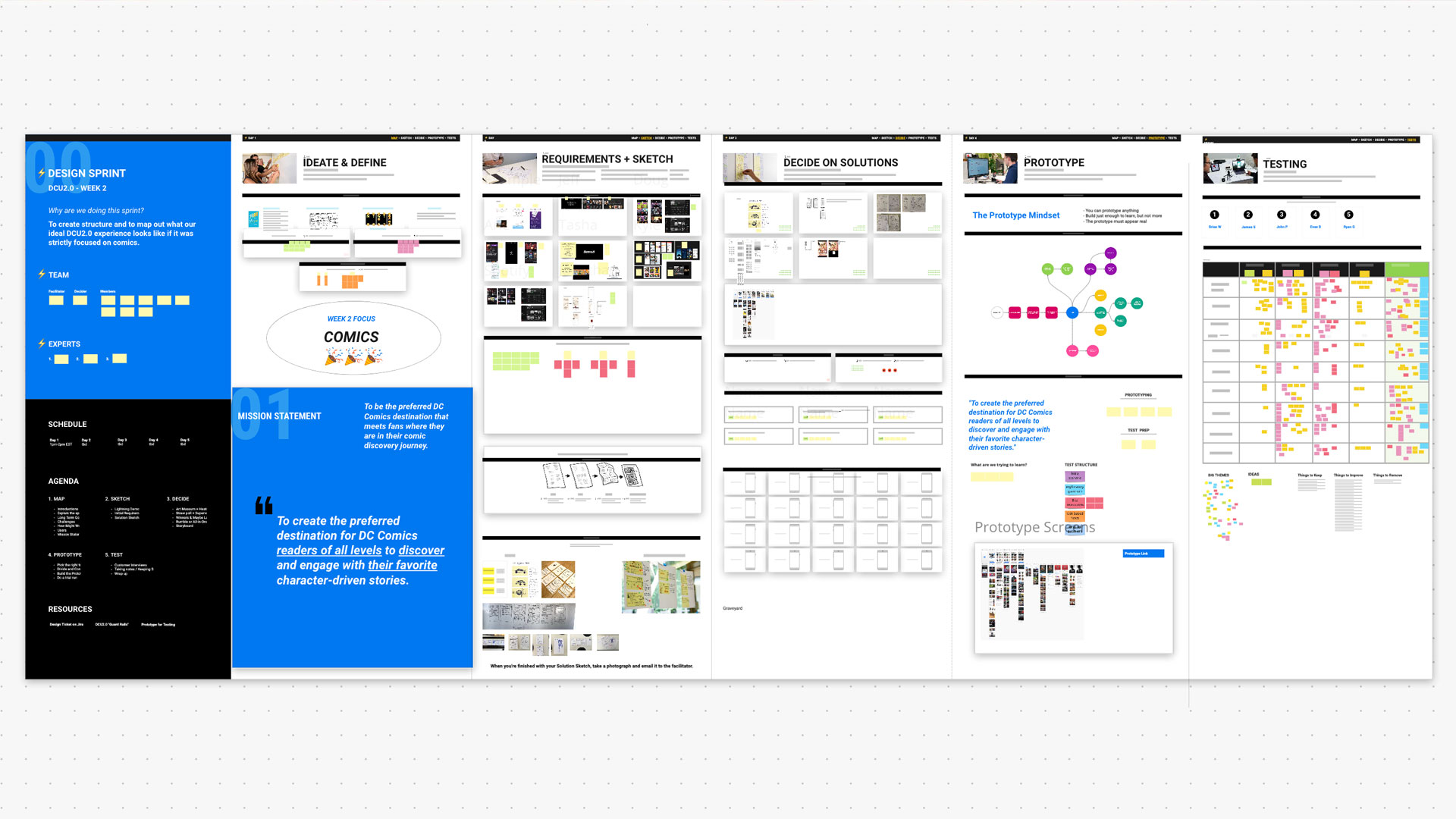
2 years after the launch of DC Universe, our team was given a opportunity to explore a full overhaul of the product. I led this initiative by hosting, moderating, and participating a series of design sprints with a group of cross-team colleagues, aimed to create the ultimate comic book fan experience. We did a couple of these highly collaborative week long design sprints, but this project documents just one of them, aimed specifically at DC Comics readers.
The Format
One week to ideate, define, sketch, decide, prototype, and test a blue sky exploration of what we believe DC Universe can be should the stars align.
The Team
For this exercise, we assembled a team of roughly 8-10 rotating people, consisting of members from design, product, marketing, and content teams.
The Mission
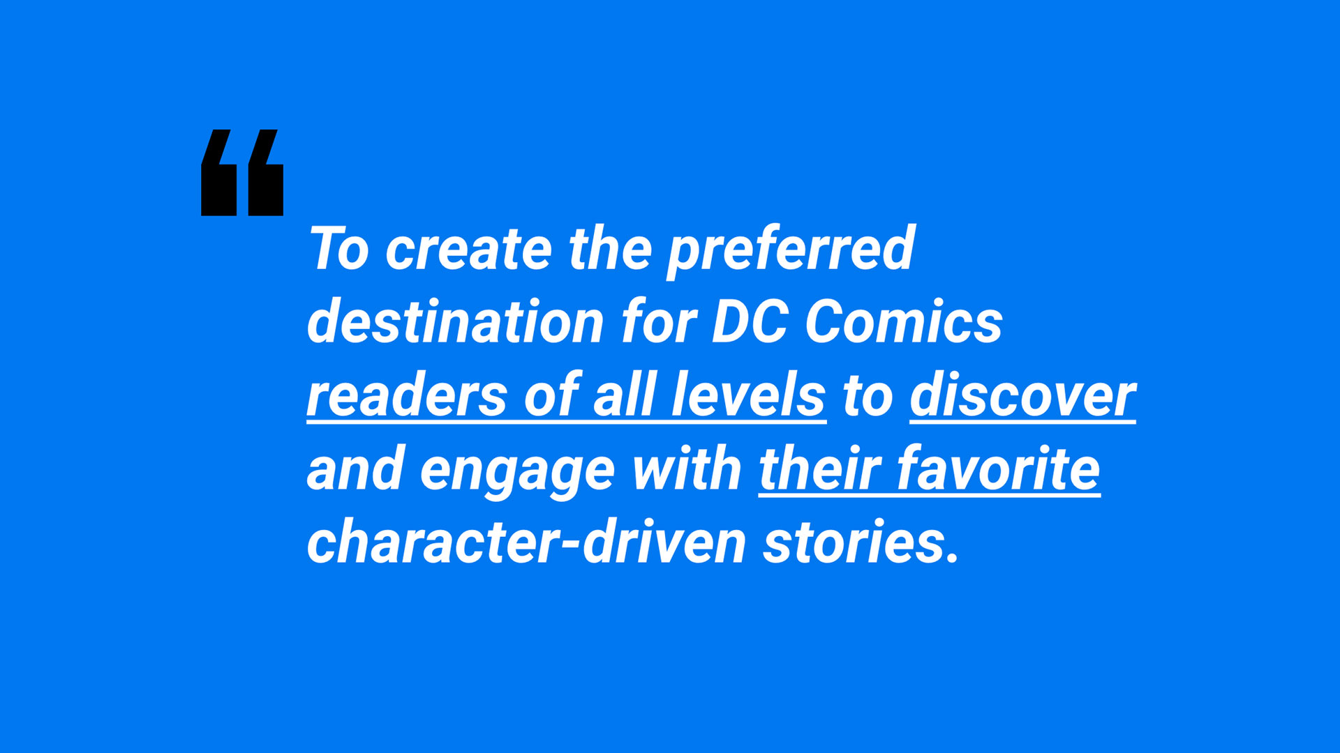
The mission statement for this specific design sprint was "To create the preferred destination for DC Comics readers of all levels to discover and engage with their favorite character-driven stories." Our team focused on this mission statement for the week. And whenever we felt undecided or doubtful, we referred back to this statement as the north star.
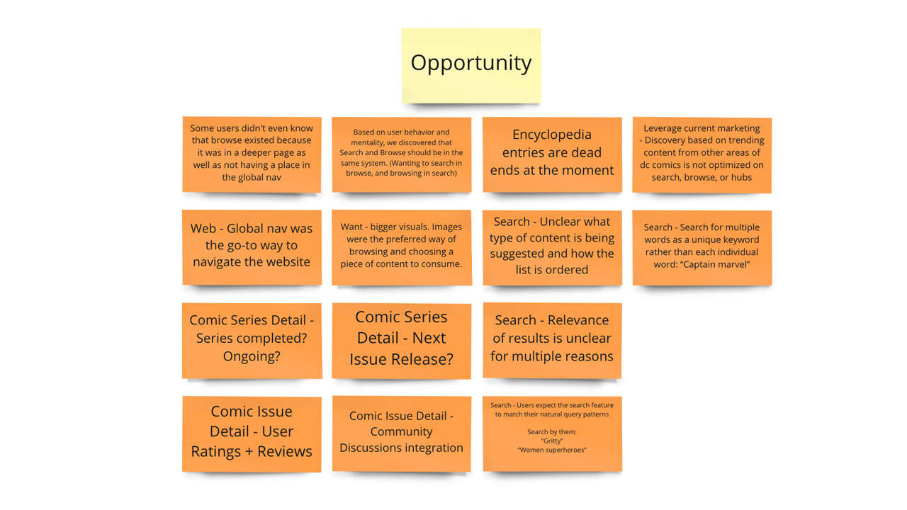
Day 1 - Ideate & Define
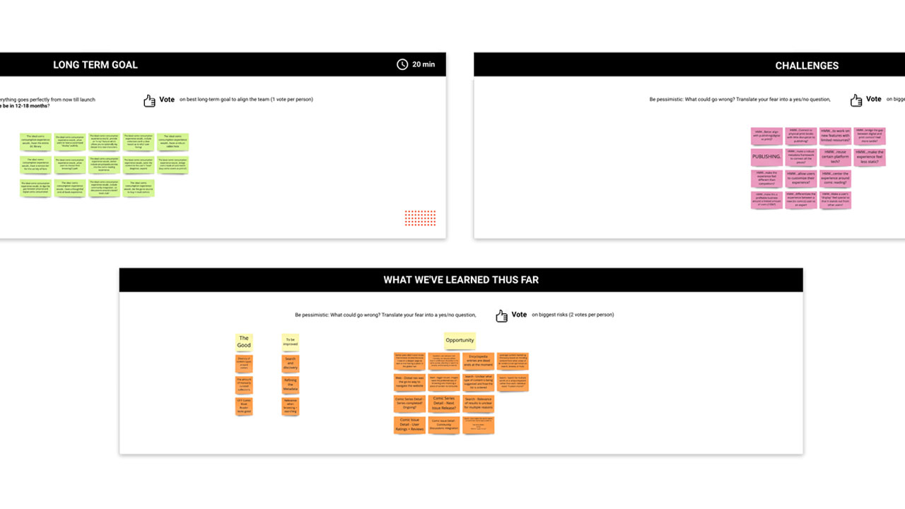
After brief introductions and explaining how the week-long design sprint will work, we spent the day identify problems, defining goals and challenges, and narrowing scope. At the end of the day, we agreed on a mission statement which would serve as the north star for the choices we make during this design sprint.
Day 2 - Requirements
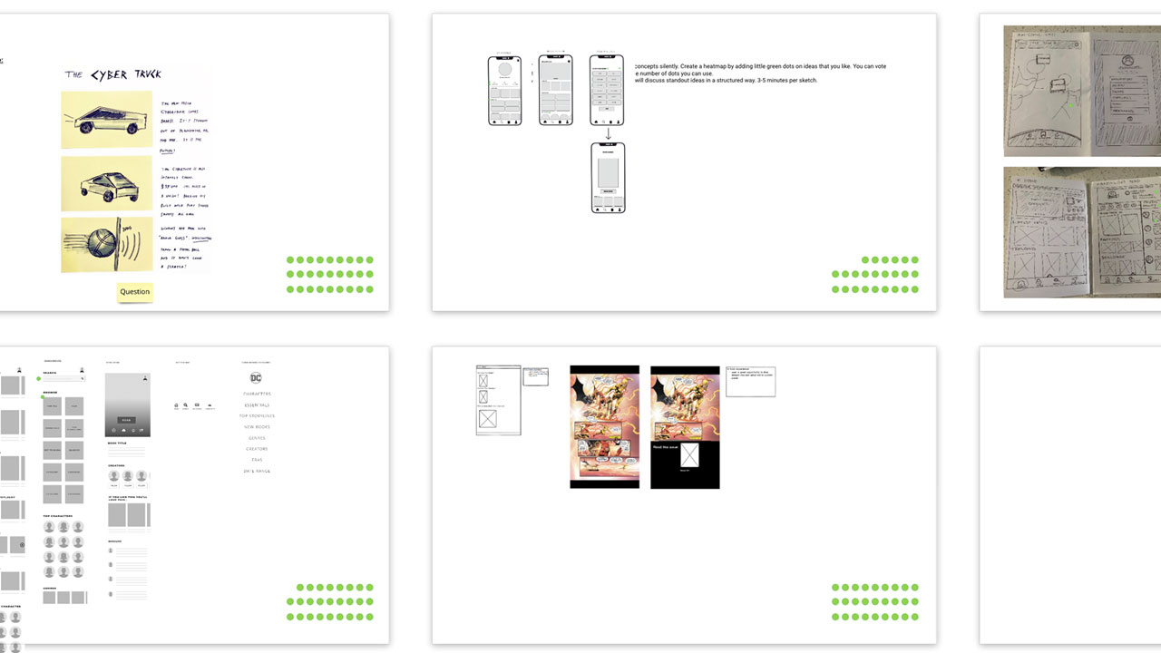
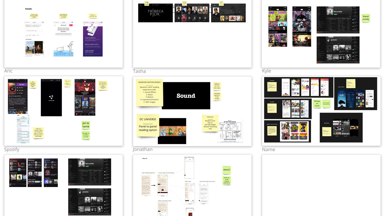
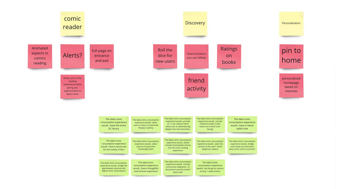
The second day was about evaluating existing ideas, brainstorm improvements, and sketch ideas. We started the day off with a lighting demos where participants showed off their favorite inspirations. We then brainstormed initial requirements which would act as food for thought during the sketching phase. The homework was to come back with sketches based on the takeaways for the day.
Day 3 - Decide
Immediately following the previous day's session, the team came back with sketches and designs based on the initial requirements. We started off the day by doing art museum (allowing members to freely browse around) and speed critiques. After critiques we stitched together our best ideas and decided on a path forward to create a working prototype for the following day. At this point, the team is heavily invested in the design sprint and excited about the final product that we'll be prototyping and testing over the next 2 days.

Day 4 - Prototype
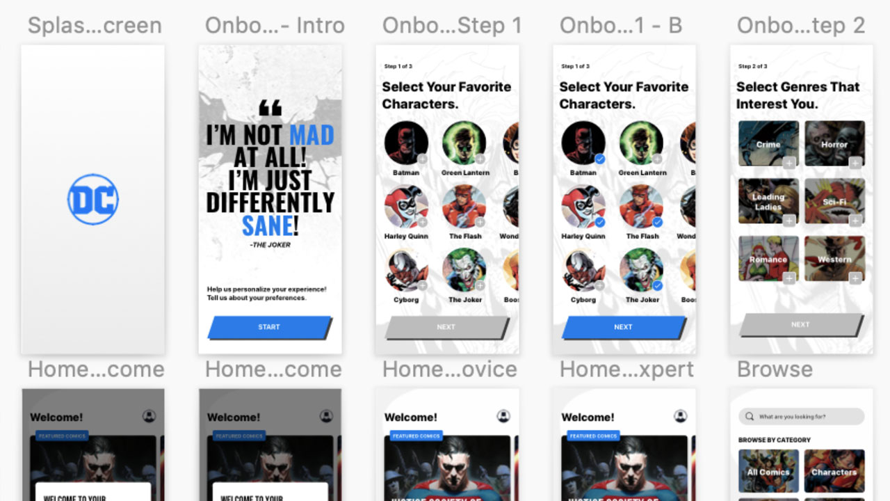
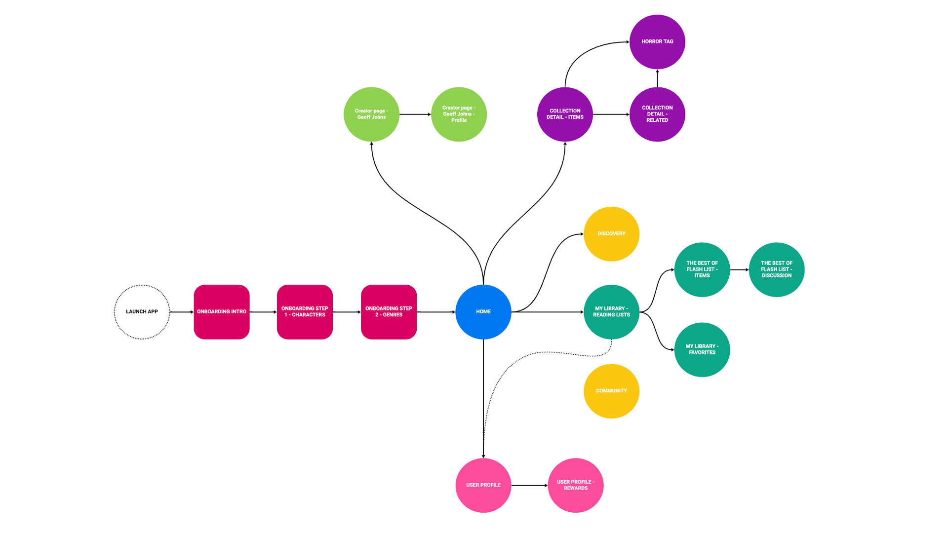
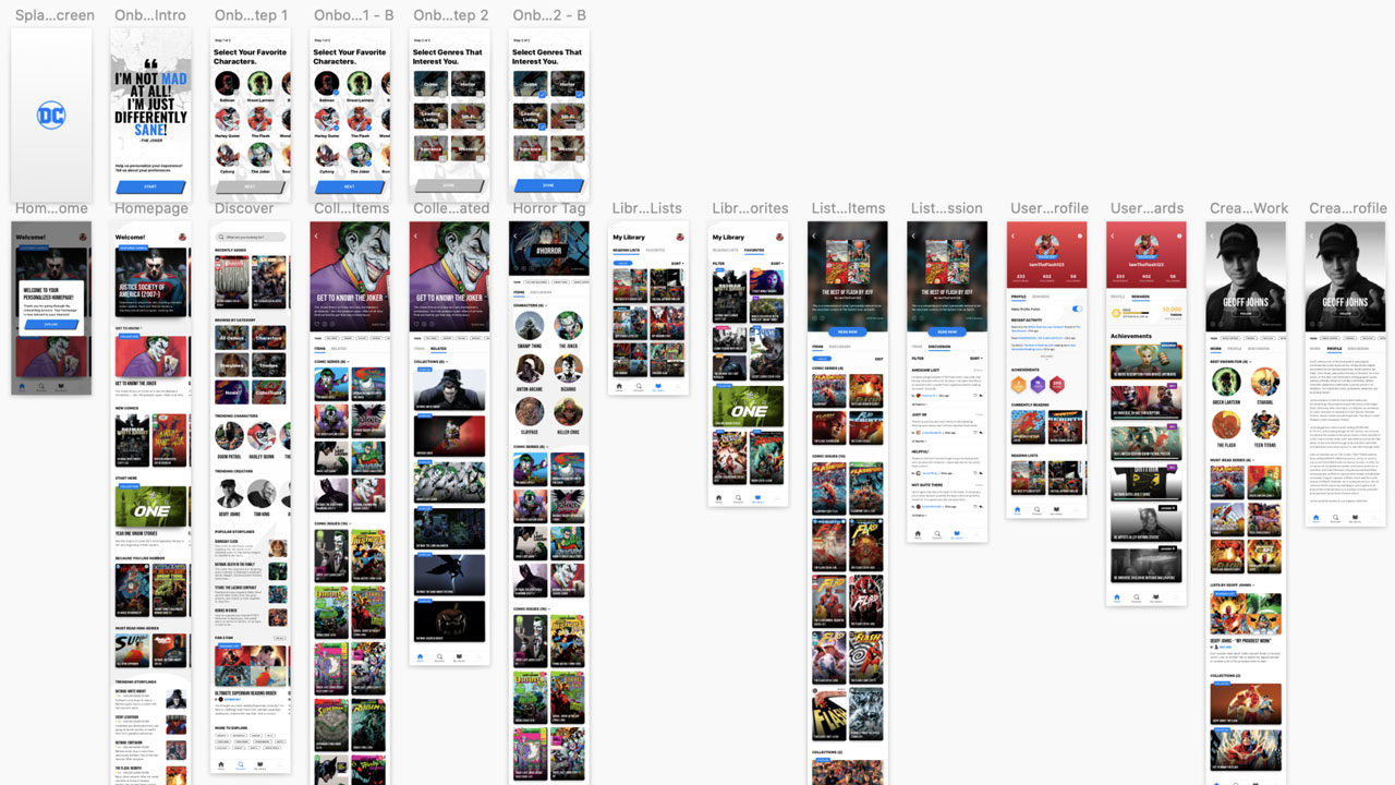
With only 1 more day left in the sprint, this day was all about head down crunch time. I started off by defining the flow of the prototype. I then asked the team to help gather assets while I spent the day crafting a working prototype in invision for the user testing session the following day. After a long day of focus, we ended with a prototype that we were proud to put in front of users to test. We also established the test plan and structure ahead of the testing the following day.
Day 5 - User Testing
Feedback time! How did we do? Day 5 marks the official last day of the design sprint, and we went ahead and tested our prototype that we made the previous day. To keep the process lean, we decided to interview a few of our colleagues with the test structure that we established. The test plan starts with a intro, followed by exploratory questions and first impressions, then on a few task based flows, and ending with wrap up questions and suggestions.
Test Synthesis
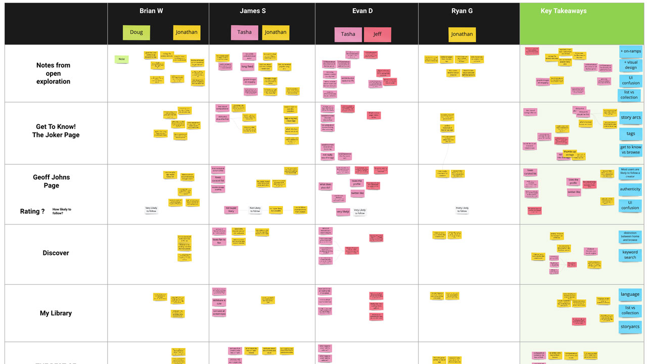
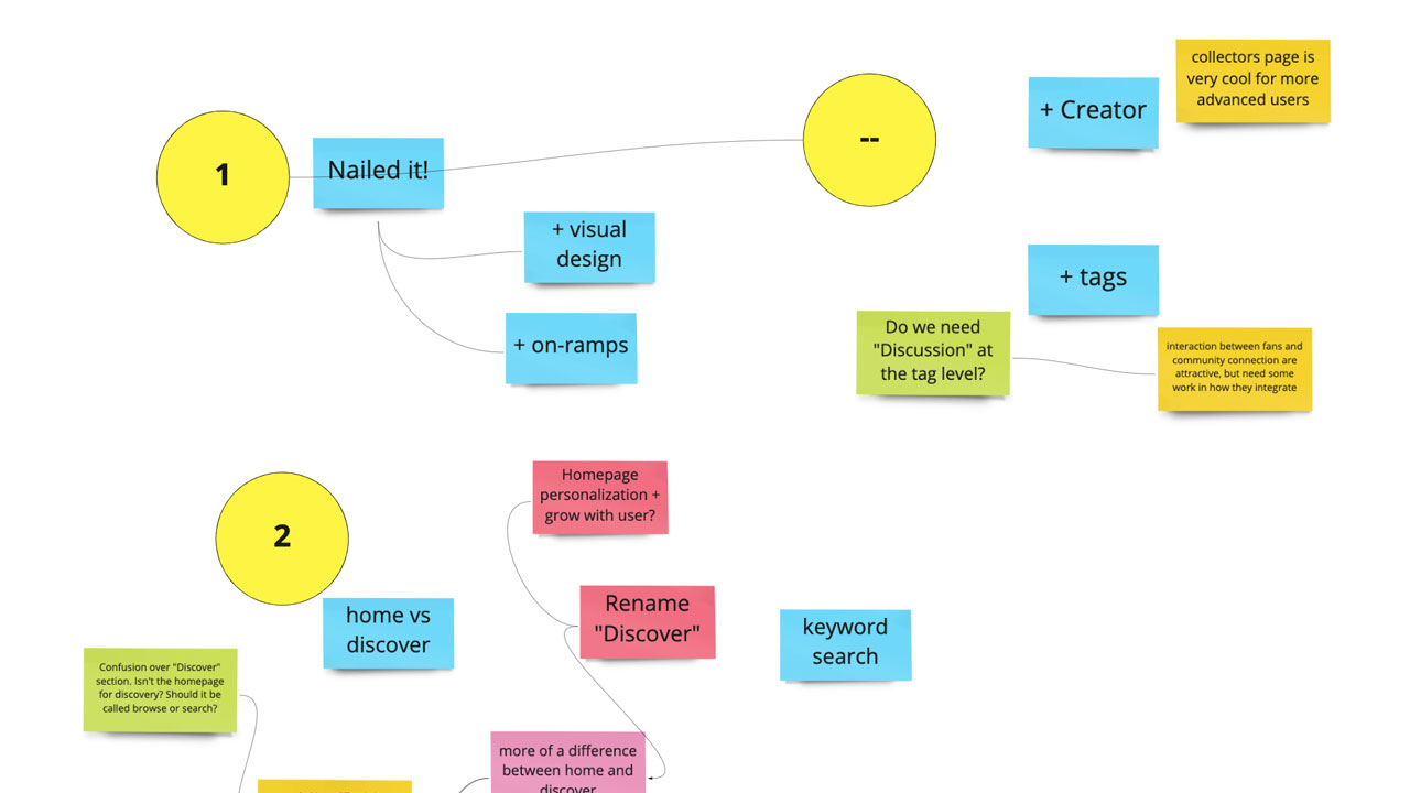
Another exciting part of the design sprint process was synthesizing all of the feedback that we gathered from the user testing. We took all of the notes that we synthesized and grouped them into actionable buckets so we have clear takeaways that we can take back to product to consider prioritizing.
Key Takeaways
We were lucky to have gotten such a large amount of feedback for our prototype. To wrap up our sucessful design sprint. here are a few of my favorite takeaways:
Home vs Discover
Home and Discover sections were not differentiated enough for users to understand their unique purpose. Home was seen by some as based on personalized onboarding choices, but others only saw it as a home page where you would discover new content or otherwise curated content.
Story Arc Priority
Whether on a Collection page, Tag Page, Reading List or Creator Page, Story Arcs were viewed as the best point of entry for starting to read. Users often didn’t find Story Arcs tucked into the secondary “related items” tab and wanted to see these prioritized in the first tab instead.
Fan to Fan
The Fan2Fan was something new that we ideated on for this prototype. The section got a lot of love. Users liked the idea of a Public Profile, Public User lists and appreciated having discussions as a section for these lists.
Got a question for me?
© JEFF HUANG 2022. ALL RIGHTS RESERVED.
